To give you a concrete example of how to make a line graph in Google Sheets, we are first going to show you how to extract some real-world data from The State of California Department of Water Resources.
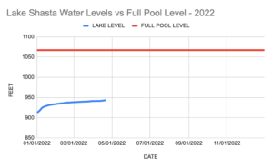
Specifically, we’re going to use a Google Sheets formula to import 2022 & 2023 daily information about the water level of Lake Shasta — and then make a line graph that shows how the lake’s water level varies over time.
Another line in the graph will represent the full pool level of Lake Shasta — 1,067 feet.
Start by copying & pasting the following formula into cell A1 of a new Google Sheet.
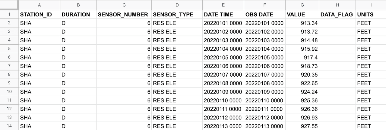
=IMPORTDATA(“https://cdec.water.ca.gov/dynamicapp/req/CSVDataServlet?Stations=SHA&SensorNums=6&dur_code=D&Start=2022-01-01&End=2022-12-31”, “,”, “en_US”)
Once this formula is pasted into cell A1, columns A through I will auto-fill with data.
The VALUE column displays the water level of Lake Shasta for each day in 2022. This column will auto-update daily from the source data.
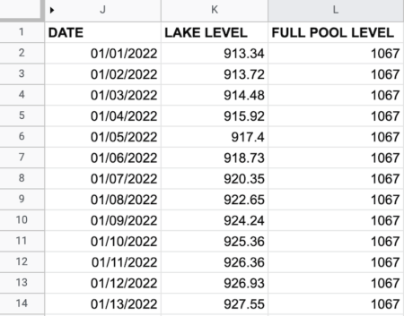
Next, add three new columns to the right of this imported data. These columns will be used for the line chart.
- Manually fill down column J with 01/01/2022 through 12/31/2022
- In the K2 field, enter “=G2” and then fill down the column
- Fill down column L with the lake’s full pool level of 1067 feet
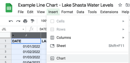
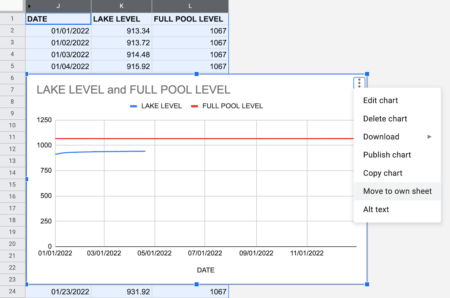
Select the three columns, J, K & L. Choose Insert > Chart from the menus. (You can optionally hide columns A through I).
Click on the ellipsis at the top right of the chart and select Move to own sheet.
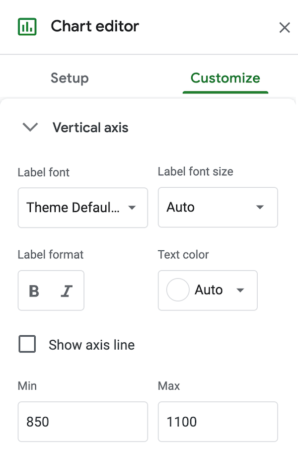
Once the line graph is in its own sheet, click on the Edit chart button.
Under Chart editor > Customize > Vertical Axis, set the Min value to 850 and the Max value to 1100.
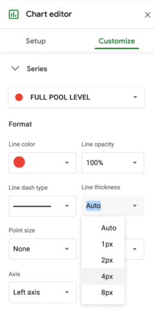
If you want to change the thickness of a line, click on the line. Then, check the Line thickness value from Auto to a specific size, such as 4px. You can also change the color of a line.
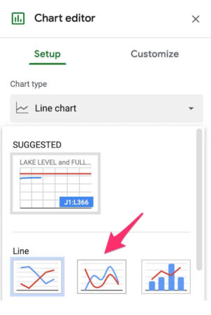
An option under Chart Editor > Setup is to change the Chart type of chart to a smooth line chart.
You can embed a Google Sheets line graph on a web page like the embed below. Because this chart is served up from a Google Sheet that is connected to the data source, the blue line will update daily.
Notice that you can hover your cursor over the blue line to see the water level for any day of the year.
We added the width and height parameters to the iframe HTML that Google Sheets provides under File > Share > Publish to the web.
<iframe src="https://docs.google.com/spreadsheets/d/e/2PACX-1vRfjsOAEqCc9HWTldW_ElxEayF9Xj6alCFg9sSZ58hXCvQ5ZF33hlrbTgufhTo3w32lAyBXxXHiqPJ6/pubchart?oid=419895885&format=interactive" width="600" height="400"></iframe>